There are many way's one can present themself through a client or an agency.To give that aura of "I'm a professional and I want to work for you" can make or break a first impression.You only have a matter of seconds in some cases to say what your business does,how you do it and how you may be approached.Without overthinking about it too much,the best way is,of course,to produce a business card into the hands of anyone who is willing to listen and give you a chance.How you utilize this oportunity is entirely dependent on an idea for the design and how willing you are to go with it,which reflects on your practices.
Of the business cards I found both physically and through the internet,I first must divide them into two groups :
those that are conventional and those that are innovative.Since the person needs to convieniently store a business card into most commonly a wallet, it's recommended that I stick to conventional design.Despite this,I'll also include some samples I found online which have some simple concepts that I found relevant.
Conventional Cards
Dan Leo, Illustrator, Graphic Designer
Information : Image, type, 3 colour, two sided, Title, Contact details, Sharp edges 2 x 3.5", iphone barcode
Front
The image featured reflects the subject and style that the artist exhibits - Graphic design / graffiti influence.
Three colours used are black,white and pink - strong choices and recommended amount needed on a business card.Also gives off the tone of his work - offbeat and unreserved.Handmade font shows branding of his business.
Back
All his information with prominent text.However not properly aligned, feels a little out of place especially on line 2.Uses sans serif font - not bad and the inclusion of the iphone barcode shows that he's up to date with modern technology.
Jonathan Edwards,Illustrator, Character Designer
Information : Image, two sided, repeat pattern, contact details, sharp edges, slightly gloss on card, 10 x 7cm, sharp edges
Front
Image captures your attention,lines and colours are quirky and have character.Describes the type of work Jonathan does.Your almost intrigued to learn more - almost like a tasting a free sample of ice cream.Despite avoiding the 3 colour rule, he gets away with it purely because of the mood that is represented,like his style and presence can bring life into a employers problem.
Back
Information and repeat pattern on back of card. Display font uses a custom font - reflects his linework and eccentric nature of his work - jagged forms and inconsistant forms that are bold.Contact details are almost lumped in - small font can be hard to read with those of poor sight, no spacing and could be more contasting against the repeat pattern.Example ; Repeat pattern could be one of the muted colours against the bright greenish yellow - stay consistant.Also it's irregular shape could be hard to keep for some.
Cards of Innovation
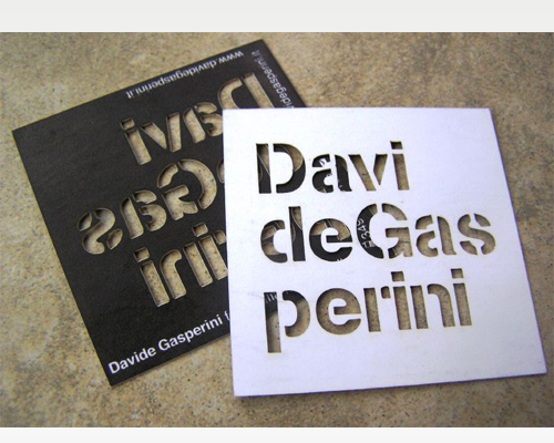
The following images are some good examples of innovative business cards that go that extra step.The more engaging your design, the deeper the interest.Good way to bring this across is interaction.Davi deGrasperini stencil design is a good example of this,as it invests in your curiosity to apply your own interpretation of his name.There is almost a bond between the artist and the viewer and it puts out the idea that a relationship can form since the artist is giving away a part of his process towards his job to better inform his targets.The contact details are there but the name is the focal point and if the employer is interested,he will search the artists information rather than the artist give the information to a client.

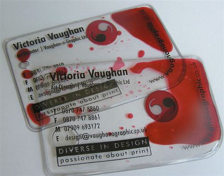
The Japanese business card and the Victoria Vaughan also engage the viewers interest.The Japanese business card reveals in the interactive element as it leaves a humourous effect on the viewer and they take away not only your business but also a charming memory about a business before they've even worked with them.It's a simple concept with universal appeal.
The Victoria Vaughan idea is even more simple ; liquid moves around inside the card.This means that the card is always changing and it works because it's well made.The card itself is transparent plastic,as well as the liquid which doesn't obscure the information.The card technically always changes as the liquid can be manipulated to form shapes depending on where the viewer moves the card.It not only gives the impression that the artist behind the card pushes herself but she is always morphing her abilities,not keeping still.

The attorney card and Hypno are in the territory of cards that let ideas fit around the format.The attorney card uses the option of pulling out the card from a holder that resembles a jail cell.This action plants a message into the viewer about how confident and the competancy of the attorneys which reflects well on them.Also,the way you have to move the card from horizontal to vertical with the layout is a great weapon as it makes you attentive with an action.This is made simplier with a simple colour scheme.

The Hypno card takes full advantage of the formatting and uses the name to incorporate the design.From the beginning, the circular design is very striking with its peculiar quality and the color choices of red,white and black are distinctive.The layout of the card has type that revolves around a tagline that's isolated at the middle which puts you in a trance - as you navigate your eye around the edge, you keep coming back to the centre.My only fault with the card is the size and whether I could conviently store it if it were presented to me.